Color Depth, Light Interaction, and Perception in Aesthetic Dentistry
In the delicate balance of color harmony, achieving a seamless match is both an art and a science. Subtle variations in tone can make all the difference, while precise instruments and environmental adjustments play critical roles. Success hinges on understanding these intricate interactions in the quest for true visual alignment.
The Physics of Depth and Perception
Layering and Light Interaction
Simply mixing pigments on a palette is rarely enough to reproduce the complex, life-like beauty found in nature. The "natural color" we perceive in high-quality restorations is not merely a surface attribute; it is the result of intricate interactions between multiple layers of material. Light penetrates the object, reflects off internal structures, and mixes with surface reflections to create a sense of depth that a flat coat of paint can never achieve.
To replicate this phenomenon, one must visualize color not as a 2D plane, but as a 3D structure. This involves a strategic stacking of layers: the foundational hue of the substrate, the intermediate modifying layers, and the final surface texture. Much like the glazing technique in classical oil painting, applying thin, translucent layers allows for a seamless gradation where boundaries disappear. This internal scattering of light is what convinces the human eye that an object is authentic and "alive."
Crucial to this process is the balance between transparency and opacity. Not all materials block light equally. Highly transparent materials allow light to pass through, picking up colors from the background and helping the object blend into its surroundings. Conversely, opaque materials block light, defining the form and masking underlying imperfections. Adjusting the thickness and density of these materials controls how light travels through the body of the restoration, preventing the lifeless, flat appearance that often results from focusing solely on surface shade.
Harnessing Optical Illusions
The human eye is a sophisticated sensor, yet it is susceptible to deception. In the realm of high-end esthetics, a perfect match isn't always about identical physical properties; it’s about perceptual harmony. This is often referred to as the "chameleon effect." The color we perceive is heavily influenced by the contrast of adjacent colors and the ambient lighting conditions. Professionals leverage these visual quirks to create seamless integration.
One advanced technique involves manipulating surface texture to control light reflection. By creating specific micro-textures, one can diffuse light reflection at the boundaries of a restoration, making the transition line virtually invisible to the naked eye. While numerical data provides a baseline, the final success relies on "sensory harmony." By understanding how the brain processes edges and contrast, a technician can trick the observer into seeing a continuous, natural form where a distinct boundary actually exists. This psychological approach to color blending complements the physical application of materials.
Bridging the Gap Between Eye and Instrument
Digital Precision in Color Analysis
Subjectivity is the enemy of consistency. When we rely solely on human vision, we introduce variables such as eye fatigue, color memory loss, and the influence of surrounding colors. To combat these limitations, modern science introduces objective measurement tools that serve as a reliable partner to the human eye. Rather than guessing based on "feeling," we can now anchor our decisions in quantifiable data.
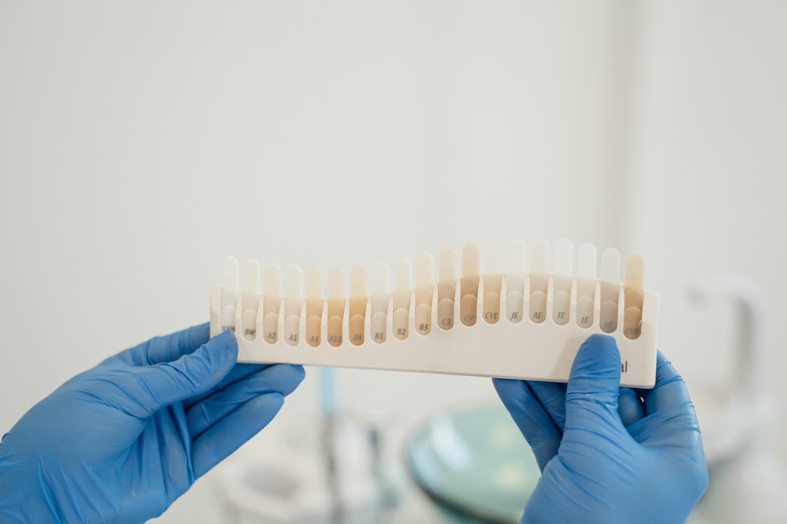
The cornerstone of this objective approach is the use of advanced optical devices that go beyond standard photography. These instruments analyze the specific wavelengths of light reflected by an object, breaking down the color into its fundamental components: lightness (value), saturation (chroma), and hue. This process captures the object's unique "optical fingerprint." By converting vague visual impressions into precise coordinates in a color space, these tools eliminate ambiguity. They provide a standardized map that remains constant regardless of who is looking or what time of day it is, ensuring that the foundational match is mathematically accurate before artistic characterization begins.
| Feature | Visual Assessment (Human Eye) | Instrumental Analysis (Digital Device) |
|---|---|---|
| Primary Strength | Detects subtle artistic nuances, texture, and overall harmony. | Provides absolute, objective numeric data (Lab* values). |
| Consistency | Low. Affected by fatigue, mood, age, and ambient light. | High. Delivers repeatable results regardless of time or user. |
| Communication | Subjective. Relies on descriptive terms like "warmer" or "paler." | Precise. Uses universal data coordinates for clear instructions. |
| Limitation | Susceptible to optical illusions and contrast effects. | May struggle with extreme translucency or complex multicolored patterns. |
Standardizing Communication
The greatest benefit of introducing digital measurement into the workflow is the dramatic improvement in communication between clinical and technical teams. When a clinician and a technician are in different locations, vague instructions like "make it a bit softer" or "slightly less yellow" are breeding grounds for error. These subjective terms vary wildly depending on individual perception.
However, when a specific spectral map is shared, it acts as a universal language. It removes emotion and opinion from the equation, providing a solid starting point for fabrication. While the final artistic touches—such as texture and translucency—still require the skilled hand of a master craftsman, the initial selection of the base shade becomes a matter of fact rather than guesswork. This data-driven approach streamlines the entire production process, reducing the need for remakes and ensuring that the final result aligns with the original vision.
The Crucial Role of Structural Foundation
Managing Underlying Discoloration
In the pursuit of the perfect surface finish, it is easy to overlook the canvas upon which the art is created. In dental and restorative contexts, the color of the underlying structure—the substrate—plays a pivotal role in the final optic outcome. Most high-esthetic materials are inherently translucent to mimic natural tissue. This means they behave like a thin white shirt; if worn over a dark vest, the darkness shows through, altering the perceived color of the shirt.
If the underlying preparation is severely discolored or possesses a low value (darkness), placing a standard translucent restoration over it will result in a greyish, lifeless appearance. Professionals must assess the "stump shade" accurately to decide on the opacity of the restorative material. The decision involves a trade-off: using a more opaque core to mask the dark background effectively, or using a translucent material that might require a brighter cement to compensate. Balancing this masking ability without killing the natural vitality of the restoration is a critical skill in substrate management.
The Impact of Luting Agents
The cement or adhesive layer between the restoration and the structure is not merely a glue; it is an optical layer that refracts and filters light. This final interface can drastically shift the value and chroma of the final result. Luting agents come in various shades, ranging from clear and translucent to opaque white or warm yellow.
Because the refractive index changes when the material is bonded, dry-fitting a restoration often leads to inaccurate color assessment. To mitigate this, the use of simulation pastes—often called "try-in" pastes—is essential. These water-soluble pastes mimic the final color and refractive properties of the cured cement. They allow the clinician and patient to preview the final aesthetic outcome under wet conditions. By testing different cement shades before the irreversible bonding process, one can fine-tune the brightness or warmth, effectively using the cement as the final "color correction" layer of the procedure.
Mastering Environmental Variables
The Phenomenon of Shifting Colors
One of the most frustrating challenges in shade matching is the physics of light sources, specifically a phenomenon known as metamerism. This occurs when two colors appear to match perfectly under one light source (like a fluorescent office light) but look completely distinct under another (like natural daylight). This happens because the two objects have different spectral reflectance curves; they are made of different materials that reflect light wavelengths differently, even if they look the same to the eye in specific conditions.
For example, a restoration might look perfect in the clinic but appear too bright or too yellow when the patient steps outside. This discrepancy erodes trust and signals a failure in the matching process. To avoid this, reliance on visual checking alone is insufficient. Digital tools that measure spectral reflectance help identify these potential mismatches early. Furthermore, understanding that "color" is actually a sensation created by the brain in response to light stimulation helps professionals realize that changing the light changes the reality of the color itself.
| Lighting Condition | Characteristics | Best Use Case in Shade Matching |
|---|---|---|
| Natural Daylight (North Sky) | Full spectrum, balanced, high CRI (Color Rendering Index). | The gold standard for final verification and checking true hue. |
| Incandescent / Warm LED | High in red/yellow wavelengths, low in blue. | Useful for checking how restorations look in evening/home environments. |
| Standard D65 Fluorescent | Calibrated daylight simulation (approx. 6500K). | Essential for consistent, baseline color evaluation in the lab or clinic. |
| Typical Office Fluorescent | Often has "spikes" in green/blue spectrums. | Can cause metameric failure; generally poor for critical color analysis. |
Optimizing the Viewing Conditions
To consistently achieve "invisible" restorations, the viewing environment must be rigorously controlled. Just as plants require specific light spectrums to grow, accurate color perception requires a balanced spectral distribution. If the ambient lighting is deficient in certain wavelengths, those colors simply cannot be seen, no matter how good the observer's eyes are.
Standardizing the environment involves using color-corrected lighting, typically rated at 5500K to 6500K (D65), which simulates a neutral daylight at noon. Furthermore, professionals must minimize "chromatic noise." Brightly colored walls, the patient’s clothing, or even the clinician's gloves can reflect colors onto the object, skewing perception. By maintaining a neutral grey background and ensuring the light source has a high Color Rendering Index (CRI), the variables are reduced. This scientific control of the environment transforms shade taking from a guessing game into a repeatable, reliable protocol.
Q&A
-
What is the role of a spectrophotometer in shade mapping?
A spectrophotometer is crucial in shade mapping as it accurately measures the color of a sample by analyzing the light reflected from it. This device helps in determining the precise shade, ensuring consistency and accuracy in color matching, which is particularly important in fields like dentistry and paint manufacturing.
-
How do value, chroma, and hue balance affect color matching?
Value, chroma, and hue are the three dimensions of color that must be balanced to achieve an accurate color match. Value refers to the lightness or darkness of a color, chroma indicates the intensity or saturation, and hue is the color type itself (e.g., red, blue). Properly balancing these elements ensures that the color appears correct under various lighting conditions and meets the desired aesthetic.
-
What is substrate color masking and why is it important?
Substrate color masking involves covering or adjusting the underlying color of a material to prevent it from affecting the final appearance of the applied color. This is important in applications like painting or cosmetic dentistry, where the substrate color could alter the intended shade, leading to inaccurate results and dissatisfaction.
-
Why is try-in paste evaluation critical before finalizing a color application?
Try-in paste evaluation allows for the testing of color matches before permanent application. This step is critical as it provides an opportunity to assess how the color appears in real-life conditions and make adjustments if necessary, thus avoiding costly mistakes and ensuring the final result meets expectations.
-
How can metamerism be avoided in color matching processes?
Metamerism occurs when colors match under one lighting condition but not another. To avoid this, it's important to evaluate colors under multiple lighting conditions and use consistent, standardized lighting during the color matching process. Additionally, selecting pigments with similar spectral properties can help reduce the likelihood of metamerism.